Crosse & Blackwell
Pack Revamp.
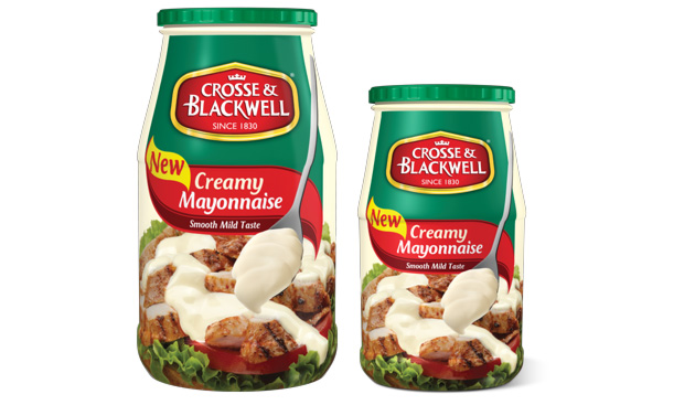
Having launched a new creamy variant to take on their largest competitor, Crosse & Blackwell decided to run a pilot-study of the revamp by also moving from a label to a full shrink sleeve to give increased scope for branding and appetite appeal.
Challenge:
To retaining the key brand assets (logo and colour).
To find optimum serving suggestion imagery for a product with multiple food uses.
Solution:
Upweighting the brand logo within the corporate CI.
Making the product the hero in the serving suggestion, rather than the food.
Creating a much bolder on shelf presence.
SHARE